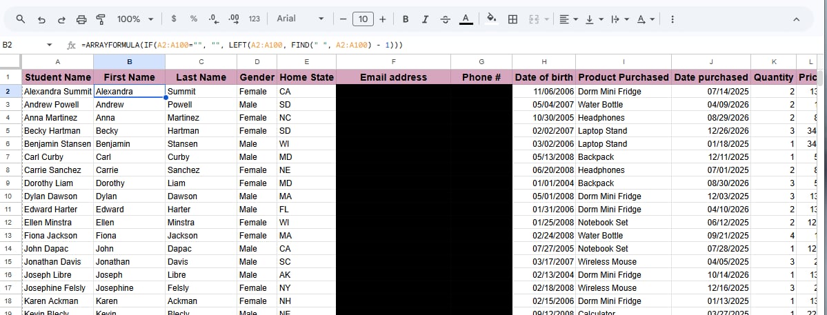
Data Entry

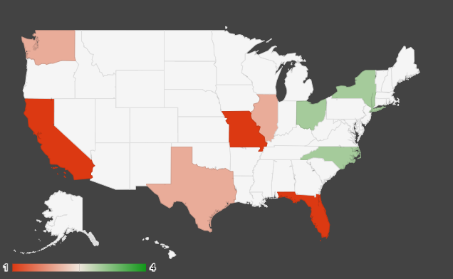
This Geo Map I created in google sheets shows the states with the most ordered products.
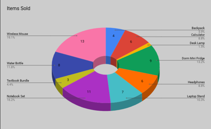
This Chart shows the most items sold.
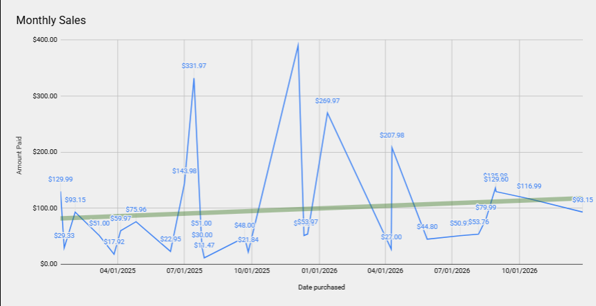
This table shows monthly sales.
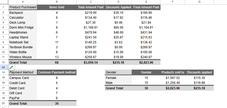
This table shows the number of products sold, total amount paid, discounts applied and final amount paid. It also showcases the Common payment method used for purchase and creates a comparison which gender bought the most of the products.
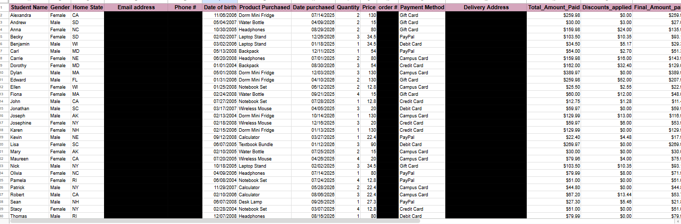
This is the Data Entry, the source of the other slides I created.
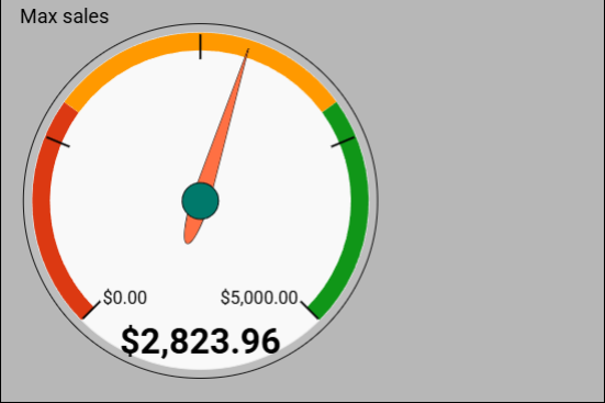
This gauge chart shows the Maximum per day, this chart automatically updates if source updates just like the previous charts.
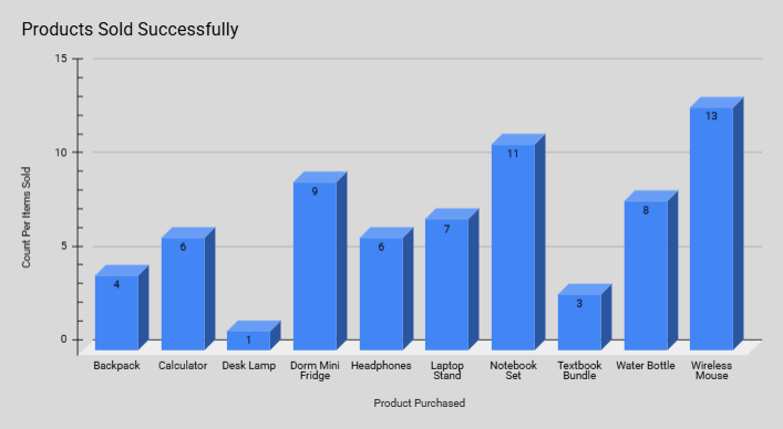
This Column chart the products sold successfully.
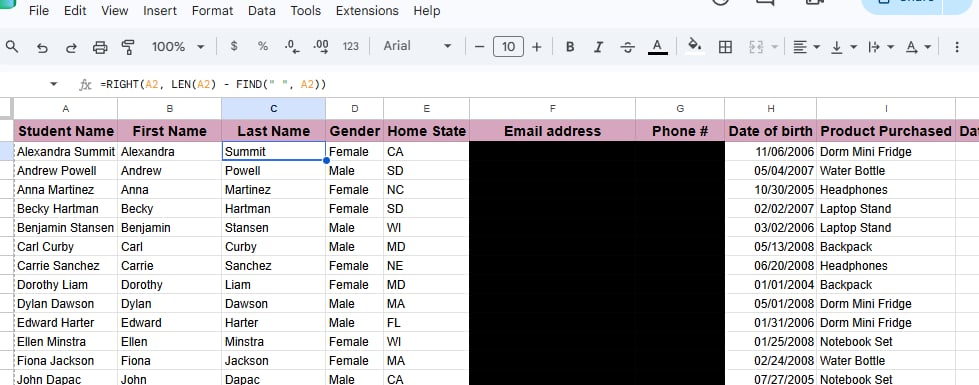
This is sample formula to separate Items in a column. (E.g, complete name)